How to Improve Website Conversion Rates: A Guide for Framer Users
Improving your website's conversion rate is about turning casual visitors into customers, subscribers, or qualified leads. It's less about secret tricks and more about a methodical process: understanding how people use your site, clarifying your message, and removing any friction that stops them from taking that final step. Ultimately, it's where smart, data informed analysis meets thoughtful, performance driven design in Framer.
How to Establish Your Conversion Rate Baseline
Before you start rearranging buttons or rewriting headlines, you need a starting point. Diving into changes without knowing your current performance is like sailing without a compass—you'll be busy, but you won't know if you're getting closer to your destination. Figuring out your baseline is the essential first step to genuinely improving your website's conversion rates and building a better website faster.
This all starts with defining what a "conversion" actually means for your business. If you're running an ecommerce shop, a conversion is a sale. But for a designer showcasing their portfolio, it might be a submission through their contact form. For a SaaS company, the goal could be a demo request or a free trial signup.
Key Takeaway: Your conversion rate isn't just a vanity metric. It's a direct reflection of how persuasive your website is. Stop chasing some universal "good" number and focus on systematically improving your own rate.
Finding Your Number
Once you've nailed down your primary conversion goal, it's time to get into the data. You can start with Framer's built in analytics or, for a deeper dive, connect your site to a tool like Google Analytics. The objective here is simple: find your current conversion rate, which is just the percentage of visitors who complete the action you want them to take.
Industry averages can give you a sense of realistic targets. Typical ecommerce conversion rates swing from 1.4% to over 4.7% for the best performing stores, while B2B service sites might see rates around 1-3%. Remember though, a lower conversion rate isn't necessarily bad if each conversion is worth significantly more.
Setting Realistic Benchmarks
Context is everything when evaluating your performance. Different traffic sources also convert at wildly different rates. Understanding this can help you focus your optimization efforts where they'll have the most impact.
Average Conversion Rates by Traffic Source
This table compares the typical conversion rates from different online traffic channels, helping you prioritize your optimization efforts.
Traffic Channel | Average Conversion Rate | Key Optimization Tactic |
|---|---|---|
Email Marketing | 3-5% | Personalize offers and segment your audience |
Organic Search | 2-4% | Align content with user intent and optimize landing pages |
Paid Search | 2-3% | Create highly relevant ad copy and dedicated landing pages |
Direct Traffic | 1-2.5% | Ensure a clear, intuitive homepage and navigation |
Social Media | 0.5-1.5% | Match the landing page experience to the social post's promise |
Knowing where your most valuable traffic comes from is just as important as knowing your overall conversion rate.
This data driven approach shifts you from wishful thinking to a concrete action plan. With a baseline firmly established, every change you make can be measured against it, telling you exactly what works and what doesn't. Now, you're ready to start making targeted optimizations that actually move the needle.
Crafting a Frictionless User Experience in Framer
A seamless user experience is the absolute bedrock of high conversions. Think about it: when you land on a site and feel confused, frustrated, or lost, you don't stick around to figure things out. You just leave. For anyone building with Framer, crafting that smooth journey from the first click to the final action isn't just a design preference—it's a direct line to business growth.
The goal is to make it so effortless for a user to get what they want that they don't even have to think about it. Removing a single unnecessary field from a form can send conversions soaring, which just goes to show how tiny points of friction can have a massive negative impact.
Streamline Your Site Navigation
Confusing navigation is one of the quickest ways to kill your conversion rate. If people can't find what they're looking for in seconds, they'll assume it doesn't exist and head for the back button. Your navigation needs to be logical, predictable, and clean.
Here's how to get it right:
Keep Your Menu Tight: Stick to 5 to 7 main menu items. Too many options create decision paralysis.
Label with Clarity: Drop the clever jargon. Use straightforward terms like "Services," "Pricing," and "Contact" instead of "Our Magic" or "Let's Vibe."
Maintain Consistency: Your navigation bar should be in the same spot, with the same options, on every single page. No exceptions.
A pro move in Framer is to build your navigation as a Component. This way, any change you make to the master component automatically updates across your entire site, locking in that crucial consistency without any tedious manual edits.
Master Visual Hierarchy to Guide Attention
Visual hierarchy is simply the art of arranging elements to lead the user's eye to what matters most—usually, your call to action. You're the director here, telling the user where to look through the strategic use of size, color, and placement.
Your headline should always be the biggest text on the page. Subheadings come next, followed by body copy. This creates a natural reading flow. Your main CTA button should use a contrast color that stands out from the background, practically begging to be clicked. We know from research that users often scan pages in an F shaped or Z shaped pattern, so placing your key info along these paths can make a world of difference.
Framer Tip: Get comfortable with Framer's Stacks feature. It's brilliant for creating organized, responsive layouts that maintain a clear hierarchy on any device. Stacks give you total control over spacing and alignment, keeping your design tight and professional, no matter the screen size.
Build for Mobile First and Obsess Over Speed
With over 60% of website traffic now coming from mobile devices, a "mobile first" mindset isn't optional anymore. A site that looks great on a desktop but is a mess on a phone is actively turning away most of its potential customers. This is where starting with a solid foundation really pays off. Premium templates are designed from a mobile first perspective, giving you a flawless experience right from the start.
Finally, don't forget about speed. Page load time is a massive UX factor. Even a 1 second delay can slash conversions by up to 12%.
In Framer, you can boost your site's speed by:
Optimizing every image before you upload it
Being mindful of heavy animations or too many custom fonts
Letting Framer's automatic image optimization and global CDN do the heavy lifting
By zeroing in on these core UX principles, you can transform your Framer site from a simple online brochure into a seriously effective conversion machine.
Writing Copy and CTAs That Actually Convert
Think of your website's copy as your most dedicated salesperson. It works 24/7, speaking directly to every person who lands on your site. If that copy is unclear, uninspired, or unconvincing, it's like having a salesperson who mumbles. You can have the best design in the world, but it's the words—the copy and the calls to action—that invite people inside and actually get them to commit.
This is especially true for designers, developers, and entrepreneurs. Your words need to do more than just describe what you do; they have to sell the value behind it. It's about shifting the focus from a dry list of features to the tangible benefits your audience gets.
Crafting a Compelling Value Proposition
Your value proposition is the beating heart of your copy. In a visitor's mind, it has to answer one simple question: "What's in it for me?" And it needs to do it fast. Within seconds of hitting your page, a visitor should know exactly what you offer and why it's a better choice than the other dozen tabs they have open.
This isn't the place for vague industry jargon. You have to be specific and relentlessly benefit driven. Instead of a snooze fest like, "We sell innovative solutions," try something direct and actionable: "Launch your professional portfolio in a single afternoon." See the difference? The second one speaks directly to a designer's need for speed, efficiency, and a quality result.
Key Takeaway: The best copy doesn't just describe; it persuades. It gets ahead of a visitor's questions and answers them proactively, building trust and gently nudging them toward the next logical step.
For instance, when promoting our LaunchNow Essentia template, the copy doesn't just list its features. It hammers home how it saves entrepreneurs weeks of development time, freeing them up to focus on what actually makes them money—growing their business.
Engineering Powerful CTAs
After all that hard work, the Call to Action is where the magic happens. Or doesn't. A weak, generic CTA like "Submit" or "Click Here" is a massive wasted opportunity. The text on your button should be a powerful, action oriented phrase that reinforces the value the user is about to get.
When you're writing CTAs, keep these principles in mind:
Use Action Verbs: Start with a strong command word. "Get," "Build," "Start," and "Join" are all excellent choices.
Create Urgency Without Being Pushy: Phrases like "Get Instant Access" or "Start Your Free Trial Today" give people a little push to act now, not later.
Focus on the Outcome: Instead of "Download," try "Get My Free Guide." This small shift frames the action around what the user receives, not what they have to do.
One powerful technique in Framer is creating CTAs as Components with Variants. This lets you easily test different versions of your buttons to see which copy and design converts better.
Running A/B Tests with Framer's Native Testing
Let's be honest: gut feelings don't drive conversions. As a designer, developer, or entrepreneur, you know that even the most beautiful design falls flat if it doesn't persuade people to act. The only way to know what truly connects with your audience is to stop guessing and start testing.
Framer now includes native A/B testing built right into the platform, making it easier than ever to test different versions of your pages and see which ones convert better.
Setting Up A/B Tests in Framer
Framer's built in A/B testing lets you create multiple variants of any page and automatically split your traffic between them. Here's how to get started:
Create Your Test: In your Framer project, navigate to the page you want to test and access the A/B testing panel.
Build Your Variants: Create different versions of elements you want to test—maybe one headline says "Launch Your Business Today" while another says "Start Building Your Dream Website."
Set Traffic Split: Framer automatically splits your traffic 50/50 between variants, but you can adjust this if needed.
Define Success Metrics: Choose what you're measuring—clicks on a specific button, form submissions, or page views of a particular page.
What to Test First for Maximum Impact
You could test nearly anything on your site, but your time and resources are valuable. To get the most bang for your buck, focus on pages with high traffic and the elements that have the most direct influence on your primary conversion goal.
We always recommend starting with these areas:
Headlines: Your main headline is your first—and sometimes only—chance to grab a visitor's attention. Test different angles, from benefit oriented copy to problem focused questions.
Call to Action Buttons: This is a big one. Experiment with the button text, color, size, and even its placement on the page. You'd be surprised how much of an impact a simple wording change can have.
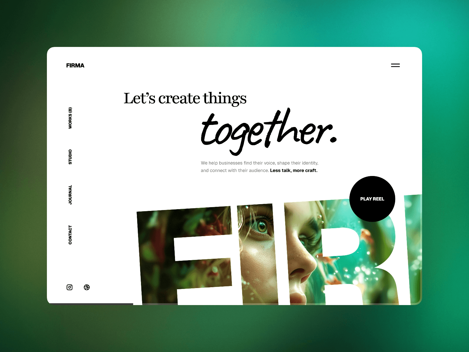
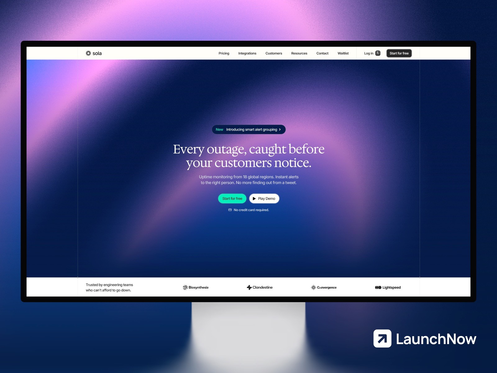
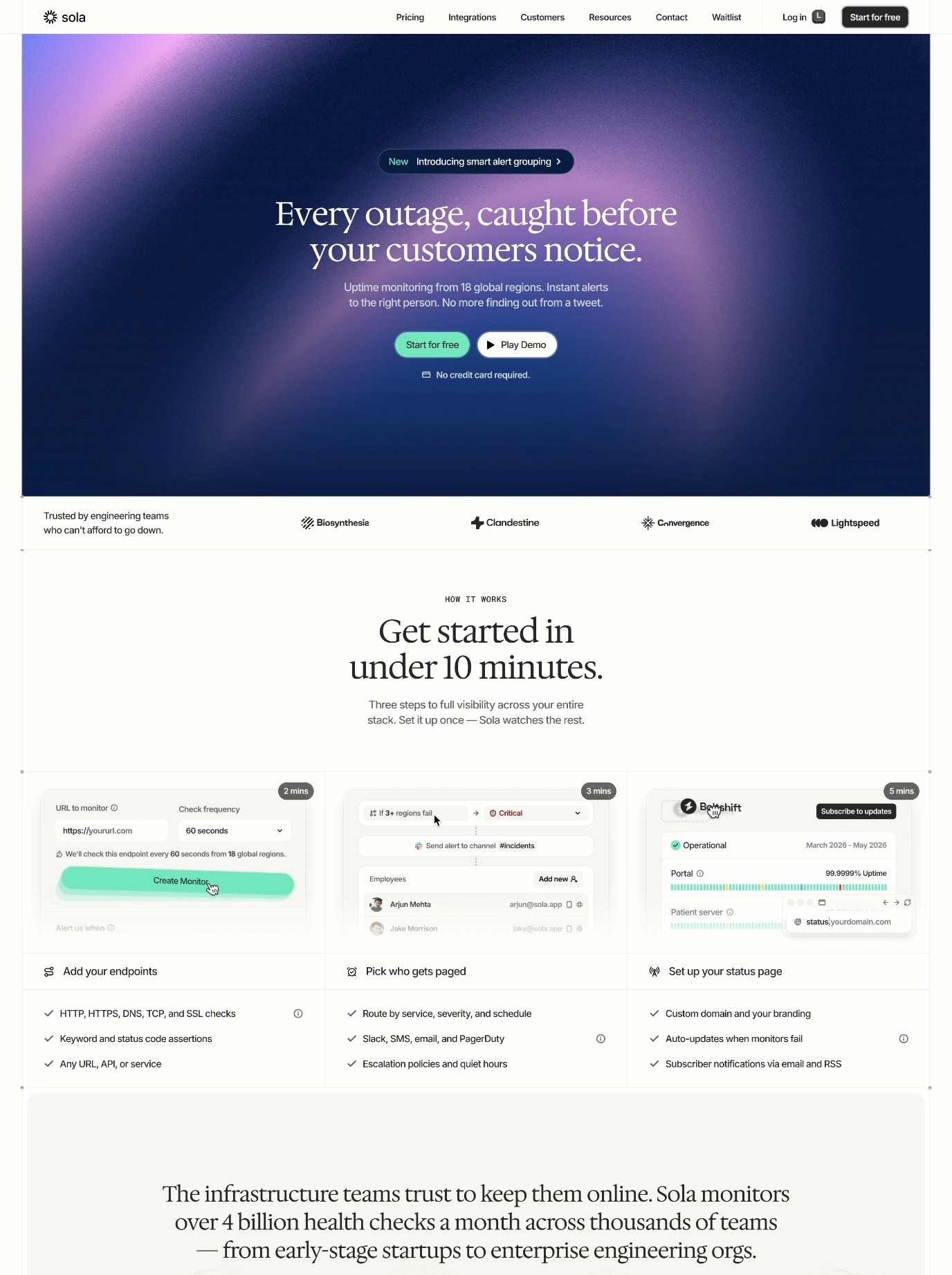
Hero Images: Does a picture of your product in action convert better than an abstract graphic or a lifestyle photo? There's only one way to find out.
Form Length: We all know that long, complicated forms are a major source of friction. Try removing just one field and see if it reduces drop off and boosts completion rates.
Analyzing Your Results
Framer's testing dashboard shows you real time results as your test runs. But the biggest mistake people make is ending a test too early. You need to run it long enough to collect statistically significant data.
A good rule of thumb is to:
Wait for at least 200-300 conversions per variant
Let the test run for at least two full weeks to account for weekday vs weekend traffic patterns
Look for a confidence level of 95% or higher before declaring a winner
Expert Insight: Don't just look at what worked, dig into the why. If a more benefit focused headline performed better, that tells you something important about how your audience thinks about your offering.
By using Framer's native A/B testing consistently, you aren't just making random tweaks—you're building a smarter, performance optimized website one data backed decision at a time.
Attracting Quality Traffic That Actually Converts
A killer design and persuasive copy are crucial, but they're only effective if the right people see them. Simply flooding your site with random visitors won't do much for your bottom line. To genuinely move the needle on conversions, you need to attract traffic that's already warmed up and ready to act.
Not all traffic sources are created equal. Some channels naturally deliver visitors who are much further along in their buying journey. The real strategy is to double down on these intent driven channels.
Target Intent Driven Traffic Channels
Picture two visitors. One stumbles upon your site from a random social media post. The other deliberately searches for "professional portfolio templates" and clicks on your result. Who do you think is more likely to convert? It's the second visitor, every time. Their search shows clear intent.
This isn't just a hunch; the data tells the same story. Research shows that organic search traffic—people who find you through Google—often converts at rates of 2-4% because they're actively looking for a solution to their problem.
Expert Insight: High converting traffic doesn't just happen. It's the direct result of creating valuable content and building strong brand recognition. When people search for solutions you provide, you want to be the obvious choice.
This is why building authority through helpful content is such a powerful, long term conversion play. Every piece of valuable content you publish, every positive community interaction, and every great customer experience builds the brand equity that drives those valuable organic visits.
Match Landing Pages to User Intent
When it comes to traffic from organic and paid search, alignment is everything. The promise you make in your Google ad or meta description has to be delivered—perfectly—on the landing page. Any mismatch between their expectation and your page's content is a recipe for an immediate bounce.
This is where dedicated landing pages come in. For instance, if you're targeting "ecommerce website templates," that click needs to take users to a page focused on your ecommerce offerings like Essentia or Axiom. Don't just dump them on your main template store and hope they find what they're looking for.
Here are a few practical tips for doing this in Framer:
Duplicate and Customize: It's incredibly easy to duplicate a core page in Framer and then tweak the headline, hero image, and copy to match a specific search intent or ad campaign. This small effort makes a huge difference.
Clean URL Structure: For landing pages built for specific campaigns, use descriptive URLs like "/portfolio-templates" or "/ecommerce-templates" that match the search intent.
SEO Optimized Foundation: Starting with a professionally built template gives you an immediate advantage. They're built from the ground up with clean, SEO friendly structure, which helps search engines understand your page's intent and can boost your rankings for those important keywords.
Running A/B Tests with Framer's Built In Testing
The days of guessing what works on your website are over. Framer now includes native A/B testing built right into the platform, making it easier than ever to test different versions of your pages and discover what actually converts your visitors.
This integrated approach means you can set up, run, and analyze tests without leaving Framer or connecting external tools. It's a game changer for anyone serious about optimizing their website's performance.
Setting Up Your First A/B Test
Framer's built in testing is designed to be intuitive, even if you've never run an A/B test before. Here's how to get started:
1. Choose Your Test Page Start with a page that gets decent traffic—your homepage, a key service page, or a popular blog post. You need enough visitors to generate meaningful data.
2. Access A/B Testing In your Framer project, look for the A/B testing option in your page settings. This opens up the testing interface where you can create and manage your experiments.
3. Create Your Variants This is where the magic happens. You can test different:
Headlines and subheadlines
Call to action button text and colors
Hero images or videos
Form layouts and field requirements
Page layouts and content organization
4. Set Your Success Metric Define exactly what you're measuring—button clicks, form submissions, or visits to a specific page. Framer tracks these actions automatically.
5. Launch and Monitor Set your traffic split (usually 50/50 for clean results) and let Framer handle the rest. The platform automatically shows different variants to different visitors and tracks the results.
What to Test for Maximum Impact
Not all tests are created equal. To get the most value from your time, focus on elements that have the biggest potential impact on your conversion goals.
High Impact Test Ideas:
Call to Action Copy: Test "Get Started Free" vs "Start Your Free Trial" vs "Try It Free Today"
Value Propositions: Compare problem focused headlines ("Tired of ugly websites?") with benefit focused ones ("Launch a stunning site in 24 hours")
Social Proof Placement: Test testimonials above the fold vs below your main offer
Form Length: Remove one field at a time to find the sweet spot between information gathering and conversion rate
Reading Your Results Like a Pro
Framer's testing dashboard shows you real time results, but interpreting the data correctly is crucial. Here's what to look for:
Statistical Significance: Don't call a winner until you have at least 95% confidence that the results aren't due to random chance. Framer calculates this for you automatically.
Sample Size: You need enough conversions to trust your results. Aim for at least 100-200 conversions per variant before making decisions.
Test Duration: Run tests for at least one full week to account for different user behavior patterns throughout the week.
Pro Tip: Sometimes a "losing" variant teaches you more than a winner. If a more aggressive headline performed worse, that tells you something valuable about your audience's preferences and comfort level.
The beauty of Framer's native testing is that once you find a winner, implementing it is instant. No complex code changes or developer handoffs—just update your live site with the winning variant and move on to your next test.
Your Next Steps to Higher Conversions
You now have a complete framework for systematically improving your website's conversion rates in Framer. But knowledge is only powerful when put into action. Here's a clear, actionable plan to get started today:
Define Your Goal and Baseline: Pinpoint your single most important conversion metric. Then, use Framer Analytics to find your current conversion rate. This is your starting line.
Conduct a UX Audit: Put yourself in your user's shoes. Is your navigation clear? Is your mobile experience flawless? Identify and eliminate one point of friction this week.
Set Up Your First A/B Test: Choose your homepage or a key service page. Test one element—maybe your main headline or CTA button—using Framer's built in testing feature.
Consider Your Foundation: If you're struggling with a clunky or slow design, consider the impact of a professional foundation. Our collection of LaunchNow templates are built with conversion optimization in mind, giving you a tested starting point rather than building from scratch.
Don't try to do everything at once. Pick one area, make a meaningful improvement, measure the result, and build from there. The compound effect of these small, data driven improvements can be absolutely transformative for your business.
Remember, every visitor to your site represents an opportunity. By systematically removing friction and testing what resonates with your audience, you're not just improving numbers—you're creating a better experience for real people who are looking for exactly what you offer.