Why Framer Is Ideal for Portfolio Websites
A portfolio website has one job — show your best work and convince visitors you're worth hiring. That means the design itself is part of the portfolio. A generic WordPress theme or a cookie-cutter Squarespace layout won't cut it when you're trying to demonstrate creative skill and attention to detail.
Framer gives you the design freedom to create something that feels custom without writing code. You get pixel-perfect control over layout, typography, and spacing, combined with built-in interactions and animations that bring your work to life. And since Framer handles hosting, SSL, and performance optimization, you can focus entirely on the design rather than managing infrastructure.
Whether you're a graphic designer, UX designer, developer, photographer, or creative freelancer, this guide walks through building a portfolio in Framer from scratch — covering structure, layout patterns, project showcases, and the details that separate professional portfolios from forgettable ones.
Planning Your Portfolio Structure
Before opening Framer, decide what pages your portfolio needs. Most effective portfolios in 2026 follow a lean structure that keeps visitors focused on the work rather than lost in navigation.
Home page: Your strongest first impression. This page should immediately communicate who you are, what you do, and show a curated selection of your best work. Think of it as your elevator pitch in visual form.
Work/Projects page: A grid or gallery of your projects with thumbnail images, titles, and brief descriptions. Each project links to a detailed case study page. Some designers combine this with the home page — showing the project grid directly on the landing page with a brief intro section above it.
Individual project pages: Deep dives into each project. These are where you tell the story — the problem, your process, the solution, and the results. This is the content that actually wins clients.
About page: Your background, skills, philosophy, and personality. Clients want to know who they're working with, not just what you can produce. Include a professional photo — it builds trust and makes you memorable.
Contact page: A simple way to reach you. An email link, a contact form, or both. Don't hide this — make it accessible from every page.
That's five page types at most. Resist the temptation to add a blog, services breakdown, testimonials page, and resume page all at once. A focused portfolio converts better than a cluttered one. You can always add sections later as your needs evolve.
Setting Up Your Framer Project
Start a new Framer project and set up your design system before building any pages. This means defining your typography scale, color palette, and spacing values upfront so every page feels cohesive.
For typography, choose one or two fonts maximum. A common portfolio approach is a distinctive display font for headings and a clean sans-serif for body text. Framer gives you access to Google Fonts and supports custom font uploads if you have licensed typefaces. Define text styles for your heading hierarchy (H1, H2, H3) and body text so you can apply consistent styling across every page. For a deeper dive into font selection, our web design fonts guide covers pairing strategies and readability best practices.
For colors, keep it simple. Most portfolios work best with a neutral base — white or near-black backgrounds with a single accent color for interactive elements and highlights. Your work should be the most colorful thing on the page, not the UI surrounding it.
Set up a max-width container component that you'll use on every page — typically 1200-1400 pixels wide with horizontal padding. This keeps content readable on large monitors while maintaining comfortable margins on smaller screens.
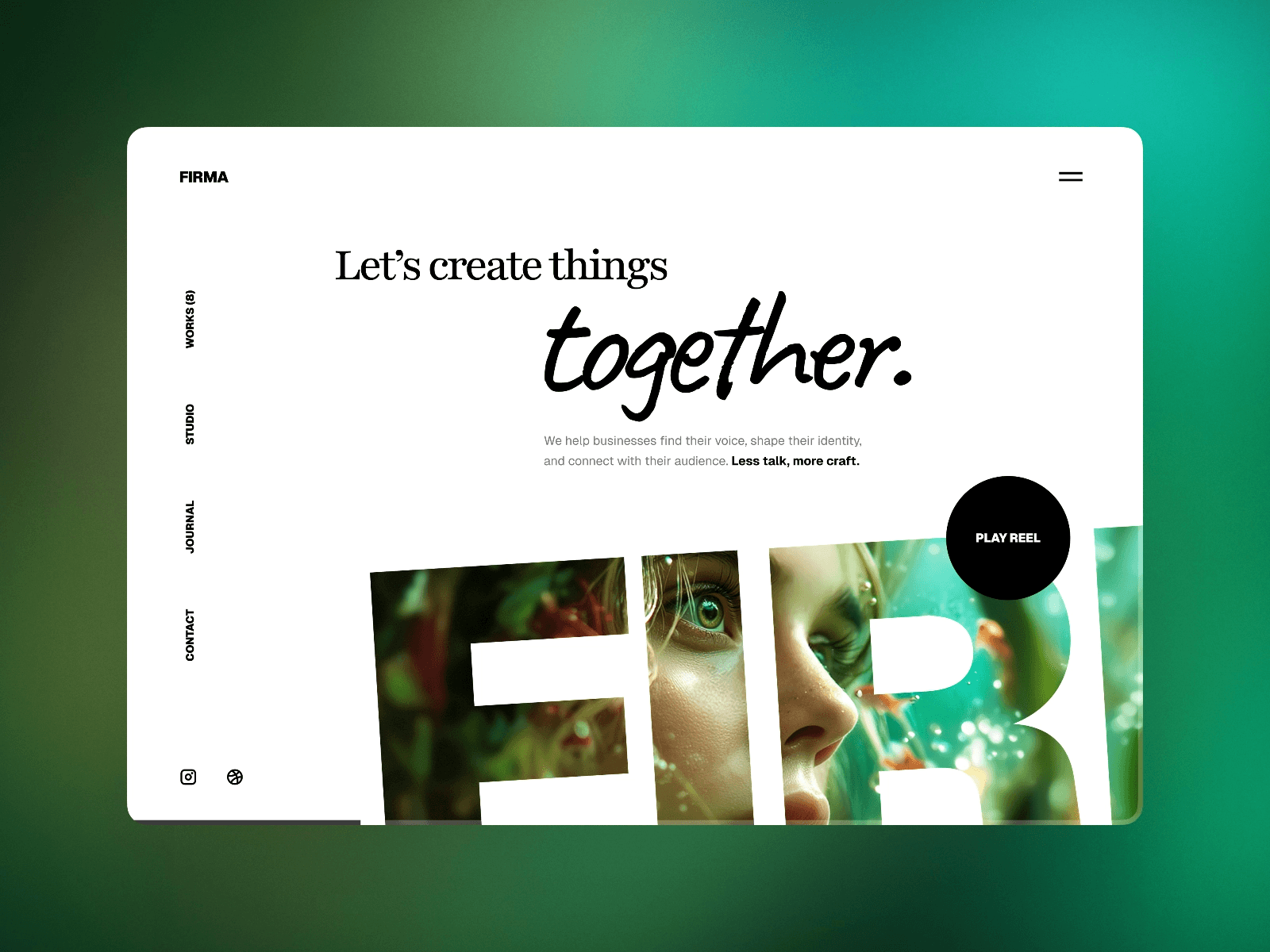
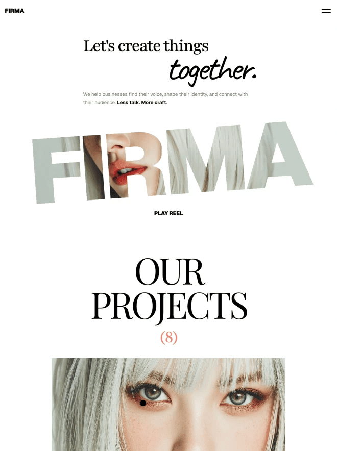
Building the Home Page
The Hero Section
Your hero section is the first thing visitors see, and you have about three seconds to communicate your value before they decide whether to scroll or leave. The hero should answer three questions instantly: Who are you? What do you do? Is your work any good?
A proven hero layout for portfolios is a bold headline with a supporting line and a single standout project image. The headline could be your name or a concise positioning statement — something like "Product Designer specializing in SaaS interfaces" rather than a generic "Welcome to my portfolio."
Avoid hero carousels and auto-playing video backgrounds. They add load time, distract from your message, and studies consistently show that visitors rarely interact with carousels. A single, well-chosen image or project preview is more effective than a rotating showcase.
In Framer, build the hero as a stack layout with the text content on one side and a project preview on the other. Set it to switch from a horizontal layout on desktop to a vertical stack on mobile. Use Framer's scroll animations to add subtle entrance effects — a gentle fade-up or parallax movement on the image adds polish without being distracting.
The Project Grid
Below the hero, display your selected projects in a grid. The standard approach is a 2-column grid on desktop, switching to a single column on mobile. Each grid item shows a project thumbnail, the project title, and optionally a one-line description or category tag.
The thumbnail images are critical. Use high-quality mockups that show your work in context — a web design displayed on a laptop screen, an app interface on a phone, a brand identity on printed materials. Raw screenshots feel unfinished. Tools like Figma, Rotato, and Framer's own device mockup components make creating polished presentation images straightforward.
For hover interactions, a common and effective pattern is revealing additional information on hover — the project description fades in, the image scales slightly, or a "View Project" label appears. Framer's variant system makes this easy: create a component with a default and hover variant, add a hover trigger, and apply smart transitions between states. Our animations guide covers transition techniques in detail.
Curate ruthlessly. Show your 6-12 best projects, not every project you've ever done. Quality over quantity is the most important principle in portfolio curation. If a project doesn't represent the kind of work you want to get hired for, leave it out.
Creating Project Case Study Pages
Individual project pages are where portfolios are won or lost. A thumbnail on your grid page gets someone interested — the case study page closes the deal.
Structure of an Effective Case Study
Project overview: Start with a large hero image of the final deliverable, the project title, and a brief summary (2-3 sentences). Include key details like the client name (if allowed), your role, the timeline, and any notable tools or technologies used.
The challenge: Describe the problem you were solving. What was the client's situation? What were the constraints? Why did existing solutions fall short? This section establishes context and helps visitors understand the difficulty and importance of the work.
Your process: Walk through how you approached the problem. Show research, wireframes, explorations, and iterations. This is where you demonstrate design thinking, not just visual execution. Include process images — sketches, user flows, wireframe screenshots, before-and-after comparisons.
The solution: Present the final design in detail. Use large, high-quality images and include enough context to explain design decisions. Don't just show — explain why you made the choices you did.
Results: If you have metrics, share them. "Conversion rate increased 34% after the redesign" or "User task completion time decreased by 45%" are powerful proof points. If you don't have quantitative results, qualitative outcomes work too — client testimonials, positive user feedback, or awards and recognition.
Layout Tips for Case Studies
Use full-width images for hero shots and key deliverables — they create visual impact and let the work speak for itself. Use contained-width text blocks (600-700 pixels wide) for written sections to maintain comfortable reading line lengths.
Break up long case studies with alternating image sizes and layouts. A full-width mockup, then a two-column comparison, then a contained screenshot with caption, then another full-width image. This rhythm keeps the page visually engaging as visitors scroll.
In Framer, build a reusable case study template as a component or page structure that you duplicate for each project. This ensures consistency across all your project pages while letting you customize content and images. If you're managing projects through Framer's CMS, you can create a project collection with fields for each case study section, automating the layout entirely. Our Framer CMS guide explains how to set up collection-powered pages.
The About Page
The about page is your chance to be a human, not just a portfolio. Clients hire people, not portfolios, and this page is where you build the personal connection that tips a decision in your favor.
Include a professional photo — not a corporate headshot with a fake smile, but something that represents your personality. It could be you at your desk, at a coffee shop, or somewhere that reflects who you are. The goal is approachability, not formality.
Write in first person and be specific. "I'm a product designer with 5 years of experience" is forgettable. "I've spent the last 5 years helping B2B SaaS companies turn complex data workflows into interfaces people actually enjoy using" tells a story and positions you for the work you want.
Include your skills and tools but don't overdo it. A simple list of your primary tools (Figma, Framer, Webflow, etc.) and competencies (UI design, design systems, prototyping) is helpful. Skill bar charts and percentage ratings are meaningless and look dated.
Add a call to action at the bottom of the about page — a direct link to your contact page or an email link. Don't make visitors navigate away to reach you after they've just read about you and are most motivated to connect.
Responsive Design for Portfolios
Portfolio visitors come from everywhere — recruiters browsing on phones during their commute, creative directors checking links on tablets in meetings, and hiring managers reviewing on desktop monitors. Your portfolio needs to look intentional on every screen size.
The project grid is the most important responsive element. On desktop, a 2-column grid gives each project enough visual weight. On tablet, you might keep 2 columns with slightly smaller thumbnails. On mobile, switch to a single column so each project gets full-width attention.
For case study pages, full-width images scale naturally, but watch your text sizing on mobile. Large display headings that look dramatic on desktop can feel overwhelming on a small screen. Use Framer's breakpoint system to scale heading sizes down proportionally — a 72px desktop heading might become 36-42px on mobile. Our responsive design guide covers breakpoint strategies in depth.
Test your portfolio on actual devices, not just browser resize. Interactions that rely on hover don't work on touchscreens, so ensure project grid items are tappable and reveal any hidden information through click/tap interactions on mobile.
Performance Optimization
Portfolio images are typically large and numerous, making image optimization especially important. Every project thumbnail, every case study screenshot, and every mockup image adds to your page weight.
Compress all images before uploading to Framer. Use WebP format when possible, target 80% quality for photographs and mockups, and size images appropriately — a project thumbnail displayed at 600 pixels wide doesn't need to be uploaded at 3000 pixels wide. Our image optimization guide covers the complete workflow.
Keep your home page lean. The project grid should load quickly since it's the first impression of your work. Use optimized thumbnails (not full-resolution project images) and let Framer's lazy loading handle images below the fold.
SEO for Portfolio Websites
Portfolio SEO is often overlooked, but it can be a significant source of inbound leads. When potential clients search for "freelance product designer" or "UX designer portfolio" in your city, you want your site to appear.
Write unique meta titles and descriptions for every page. Your home page title should include your name, role, and location — "Jane Smith | Product Designer in Austin, TX" is concise and keyword-rich. Each project page should have a descriptive title that includes the project type and client industry.
Add alt text to every image. Search engines can't see your beautiful mockups — they rely on alt text to understand what's in the image. "Dashboard redesign for FinTech startup showing analytics overview" is informative alt text that helps both SEO and accessibility.
If you're using Framer's CMS for project pages, make sure your URL slugs are clean and descriptive. A slug like /work/fintech-dashboard-redesign is far better than /work/project-12 for both search engines and humans.
Common Portfolio Mistakes to Avoid
Too many projects. Showing 30 projects doesn't make you look experienced — it makes it impossible for visitors to know which ones matter. Curate down to your 6-12 strongest pieces that represent the work you want more of.
No context or explanation. A grid of pretty images without any explanation of the design thinking behind them is a lookbook, not a portfolio. Case studies with process, rationale, and results are what convince hiring managers and clients.
Slow loading. If your portfolio takes more than 3 seconds to load, visitors leave before they see a single project. Optimize images aggressively and keep the home page lightweight.
Hidden contact information. Your email or contact form should be accessible from every page — in the header, footer, or both. Don't make interested visitors hunt for a way to reach you.
Outdated work. If your most recent project is from 2023, it raises questions about what you've been doing since then. Keep your portfolio current with recent work, even if that means removing older projects that no longer represent your skill level.
No mobile optimization. A significant portion of portfolio traffic comes from mobile devices — recruiters sharing links in Slack, creative directors checking candidates on their phones. A portfolio that breaks on mobile is worse than no portfolio at all.
Your portfolio is a living document of your professional capabilities. Build it thoughtfully in Framer, keep it updated with your strongest work, and treat the portfolio itself as a design project that demonstrates your skill. The best portfolios don't just show great work — they are great work.