Understanding the Importance of Landing Pages for Conversions
A landing page is one of the most critical components of any digital marketing strategy. Unlike a general website homepage, a landing page is specifically designed with a single purpose: to convert visitors into customers, subscribers, or leads. When you direct traffic from advertisements, email campaigns, or social media to your website, you want that traffic to go somewhere optimized for a specific action, not to a general page that offers too many choices and distractions.
The conversion rate of a landing page directly impacts your marketing ROI. A high-converting landing page can turn a marginally profitable campaign into a highly successful one, while a poorly designed landing page can waste valuable advertising spend. Well-optimized landing pages can improve conversion rates by 50% or more compared to generic web pages. In 2026, where digital competition is fiercer than ever, having dedicated landing pages is no longer optional for serious businesses — it's essential.
When you use Framer to build your landing pages, you gain access to powerful design tools that make it easier than ever to create pages that not only look professional but also drive real business results. The visual interface allows you to iterate quickly, test different designs, and see how your changes affect user engagement in real time. Whether you're launching a new product, collecting email signups, or promoting a limited-time offer, Framer provides the flexibility and control you need to create pages that convert.
The Anatomy of a High Converting Landing Page
Before you start designing in Framer, it's important to understand the key elements that make up a successful landing page. Every effective landing page typically includes several crucial components that work together to guide visitors toward taking action.
The Hero Section as Your First Impression
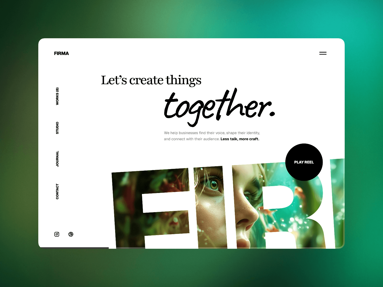
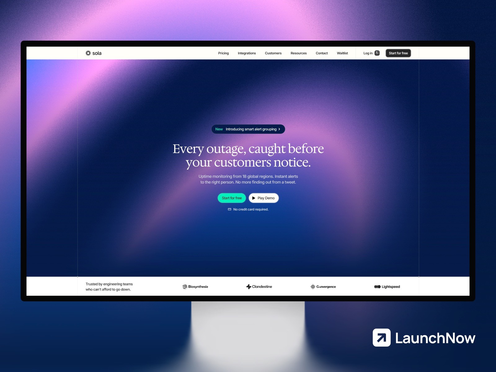
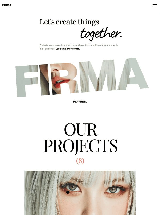
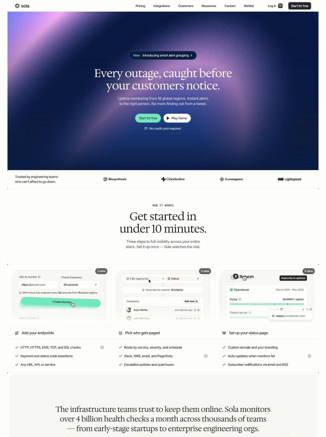
The hero section is the first thing visitors see when they land on your page, and it sets the tone for their entire experience. This section should include a compelling headline that immediately communicates your value proposition, a subheading that provides additional context or urgency, and often a high-quality image or video that supports your message visually. Your hero section needs to answer the visitor's primary question within seconds: "Is this relevant to me and worth my time?"
The headline should be clear, benefit-focused, and specific. Rather than generic claims, focus on outcomes and results. For example, instead of saying "Our Product is Great," try "Increase Your Website Conversions by 40% in 30 Days." Include a prominent call-to-action button in your hero section, such as "Start Your Free Trial" or "Get Access Today." This gives visitors an immediate option to take the next step without scrolling.
Social Proof and Trust Elements
Social proof is any evidence that others have benefited from your product or service, and it's one of the most powerful conversion drivers on a landing page. This can include customer testimonials, case studies, client logos, user reviews, or statistics about how many people have used your product. When potential customers see that others like them have already taken action and been satisfied, they're much more likely to do the same.
Include a dedicated section that showcases your social proof prominently. If you're just getting started and don't have testimonials yet, consider reaching out to early users and asking for their feedback. You can also display security badges, industry certifications, or partnership logos to build credibility. In 2026, trust is currency, and demonstrating trustworthiness is essential for converting skeptical visitors into customers.
Feature and Benefit Sections
After capturing attention with your hero section and building trust with social proof, it's time to explain what makes your offering special. The features section should clearly outline the key benefits of your product or service, focusing on how these features solve real problems or improve the visitor's life. Rather than listing technical specifications, emphasize outcomes and benefits.
Organize your features in a logical way that helps visitors understand your complete value proposition. You might group features by category, arrange them in order of importance, or structure them to follow a customer journey. Each feature should include a clear headline, a brief explanation of how it works, and ideally a visual representation such as an icon or screenshot. This structure helps visitors quickly scan and understand your offering.
Clear and Compelling Call-to-Action Buttons
Your call-to-action or CTA is the bridge between interest and conversion. A high-converting landing page typically includes multiple CTAs in strategic locations: in the hero section, after feature sections, and again near the end of the page. Each CTA should use action-oriented language that clearly states what will happen when the visitor clicks. Phrases like "Get Started Now," "Claim Your Discount," or "Download Your Free Guide" are more compelling than vague buttons like "Click Here."
The design of your CTA buttons matters significantly for conversion rates. They should stand out visually from the rest of your page through color, size, or positioning. Use contrasting colors that draw attention without clashing with your overall design. The button text should be concise but compelling, typically between 2-6 words. Ensure that buttons are large enough to be easily clickable on both desktop and mobile devices.
Building Page Structure in Framer Using Auto Layout
Framer's auto-layout feature is one of its most powerful tools for creating responsive, professional landing pages. Auto-layout allows you to build page structures that automatically adapt to different screen sizes and content changes, which is essential for creating pages that look great on everything from large desktop monitors to small mobile phones.
When you start building your landing page structure in Framer, begin by creating a main container that will hold all your content. Set this container to use vertical auto-layout, which will stack your sections on top of each other as you add them. Within this main container, add individual sections for your hero, social proof, features, and call-to-action areas. Each of these sections should also use auto-layout, typically with horizontal alignment for desktop views and vertical stacking for mobile views.
One of the key advantages of using auto-layout is that it handles responsive design automatically. As you add content or resize your layout for different breakpoints, Framer will intelligently adjust spacing and sizing to maintain a balanced design. This saves enormous amounts of time compared to manually adjusting every element for different screen sizes. For more detailed information about handling responsive design in Framer, consider reviewing our comprehensive guide on Framer breakpoints and responsive design.
Use Framer's padding and spacing controls to create visual hierarchy and guide visitors through your page. Larger spacing around important sections makes them stand out, while tighter spacing can be used to group related content together. Consistency in spacing creates a professional appearance and helps visitors navigate your page intuitively.
Crafting Compelling Headlines That Drive Action
The headlines on your landing page are arguably the most important copy you'll write. They determine whether visitors continue reading or bounce away. A compelling headline should be clear, specific, and focused on the benefit to the reader rather than on your product or service itself. The headline should immediately communicate why someone should care about what you're offering.
Effective headlines often follow a formula that includes a benefit, a specific result, and sometimes a timeframe. For example, instead of "Digital Marketing Software," try "Double Your Website Traffic in 90 Days Without Increasing Your Advertising Budget." The specificity and result-orientation make the second headline far more compelling. Your headline should answer the visitor's implicit question: "What's in it for me?"
Keep your main headline concise, typically between 8 and 12 words. This length is long enough to communicate a complete thought but short enough that visitors can read it at a glance. A subheading should support and expand on your main headline, providing additional context or answering the "how" or "why" questions. Together, your headline and subheading should give visitors a complete understanding of your value proposition in fewer than 20 seconds of reading.
Test different headlines to see which resonates most with your audience. Small changes in wording can have surprising impacts on conversion rates. Including numbers in headlines also tends to perform well — people are drawn to specific data points. In Framer, you can easily create variations of your landing page to test different headlines and measure which version converts better.
Designing Effective CTA Buttons for Maximum Impact
The button is the culmination of all your persuasive copy and design work, so getting it right is crucial. Your button should be visually distinct from other elements on the page, using a color that contrasts with your background. Many high-converting landing pages use bright colors like orange, green, or red for CTAs because these colors naturally draw the eye and signal "action."
The size of your button also matters. A button that's too small is easy to miss, especially on mobile devices. Aim for a button that's at least 45-50 pixels in height to ensure it's easily tappable on touch devices. Use clear, action-oriented button text that communicates exactly what will happen when clicked. "Sign Up Free," "Get Started Today," and "Claim My Discount" are all examples of strong button copy.
Consider adding secondary visual elements to your buttons, such as arrow icons or chevrons, to guide attention and suggest progression. Hover states are also important for desktop users — your button should change slightly when someone hovers over it to indicate that it's interactive. In Framer, you can easily create these interactive states using component variants or interactions, making your buttons feel polished and professional.
Place multiple CTAs strategically throughout your landing page. The first CTA should appear in your hero section, allowing visitors who are immediately interested to take action. Additional CTAs should appear after significant content sections, particularly after you've explained key benefits or provided social proof. The key is making it easy for interested visitors to take action at any point in their journey.
Implementing A/B Testing to Optimize Conversion Rates
A/B testing, also known as split testing, is the process of creating two versions of your landing page that differ in one key element, then measuring which version performs better. A/B testing is absolutely essential for optimizing your landing pages and improving conversion rates over time. By testing incrementally and making changes based on real data rather than assumptions, you can steadily improve how well your landing page converts.
Common elements to test on landing pages include headlines, button text, button colors, hero images, social proof sections, and page layout. Start by testing one element at a time, as testing multiple elements simultaneously makes it impossible to understand which change drove improvements. Run each test for a statistically significant period — usually at least one to two weeks — to ensure you have enough data to draw reliable conclusions.
When you A/B test, make sure you're tracking the right metrics. For most landing pages, the primary conversion metric is the percentage of visitors who complete your desired action, whether that's signing up for an email list, downloading a resource, or making a purchase. Beyond conversion rate, also pay attention to bounce rate, time on page, and scroll depth. For comprehensive guidance on improving conversion rates across your Framer website, check out our article on how to improve website conversion rates for Framer users.
Optimizing Landing Pages for Mobile Devices
In 2026, more than half of all web traffic comes from mobile devices, making mobile optimization absolutely critical for landing page success. A landing page that looks great on desktop but is difficult to use on mobile will convert poorly and waste your marketing investment. Mobile users have different behaviors than desktop users — they're often on the go, have less patience for slow loading times, and need larger, easier-to-tap targets for buttons and links.
Start by considering mobile-first design principles. Rather than designing for desktop and then shrinking everything for mobile, begin with mobile and then expand your design for larger screens. This ensures that your mobile experience is actually optimized rather than just a scaled-down version of your desktop page. Use Framer's responsive design tools to test your page on various mobile devices and screen sizes as you design.
On mobile devices, simplify your layout and focus on the most important elements. Remove sidebars, minimize background images that might slow down load times, and streamline your navigation. Your hero section should be immediately clear and compelling on a small screen with minimal scrolling required before the visitor sees your main CTA. Text should be large enough to read comfortably without zooming, typically at least 16 pixels for body text.
Image optimization is particularly crucial for mobile pages, as slow loading times are a primary cause of mobile bounce rates. Use appropriately sized images for different devices, and consider lazy loading images that appear below the fold so they only load when needed. For detailed guidance on image optimization, review our article on optimizing images for your Framer website. Touch targets should be at least 44-48 pixels in size to ensure they're easy to tap accurately on mobile devices.
Common Landing Page Mistakes to Avoid
Even experienced designers can fall into traps that reduce landing page effectiveness. One of the most common mistakes is including too many options or CTAs that compete for attention. When visitors aren't sure which action to take, they often take no action at all. Keep your focus narrow and direct all your persuasive effort toward a single, clear conversion goal.
Another frequent mistake is writing copy that focuses too much on features rather than benefits. Visitors don't care about the specifications of your product — they care about how it will improve their lives or solve their problems. Rather than saying "Our software includes machine learning algorithms," say "Our software learns your preferences and automatically optimizes your workflow, saving you 10 hours per week." Always translate features into tangible benefits that matter to your audience.
Many landing pages suffer from unclear or weak value propositions. Visitors should immediately understand what you're offering and why they should care. If it takes scrolling and reading before the value becomes clear, you've already lost many potential conversions. Your hero section should make the value proposition impossible to miss.
Slow page loading times cause visitors to bounce before your page even loads. Optimize images, minimize code, and ensure your landing pages load quickly on all connections and devices. Test your page speed regularly and address any issues promptly. For more insights on optimizing Framer websites, explore our guide on Framer SEO and optimization.
Finally, avoid using too many fonts, colors, or design styles on a single landing page. While variety can be interesting, excessive variety makes a page look unprofessional and disorganized. Stick to a consistent color palette, use no more than two or three complementary fonts, and maintain consistent spacing and alignment throughout. This cohesive design approach builds trust and makes your page easier to scan and understand.
Getting Started With Your Landing Page in Framer
Now that you understand the key elements and best practices for creating high-converting landing pages, you're ready to start building. Begin by clearly defining your conversion goal — what specific action do you want visitors to take? Next, research your target audience to understand their needs, pain points, and what messaging will resonate with them.
Sketch out your page structure before you start designing in Framer. Plan where each section will go, what content it will contain, and how it will lead visitors toward your CTA. This planning stage prevents wasted design work and ensures your page has a logical, persuasive flow. Once you have your outline, move into Framer and build your page using auto-layout to ensure it's responsive from the start.
After your landing page launches, the work isn't finished. Monitor your conversion metrics closely, gather feedback from visitors, and continuously test improvements. The best landing pages are never truly complete — they're living documents that evolve based on data and user behavior. With the right approach and Framer's powerful design tools, you can create landing pages that consistently convert visitors into customers and drive real business growth.